
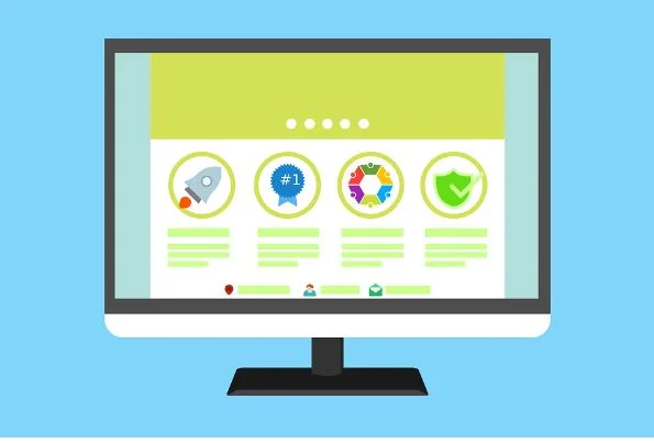
Website builders such as Wordpress have made it easier for business owners to design their own websites for free without any coding knowledge. However, without design experience, some self-built sites can end up a little uninspired or simply confusing. There are many parts to a website, but the most important is the homepage. This is what will lure people in – or alternatively drive them away. In essence, it’s your shopfront to the digital world. Here are a few DIY homepage design tips that will ensure people stay on your website.
Keep things simple
The biggest web design mistake you can make is putting too much information on the homepage. When confronted with a big wall of text, most people don’t have the patience and will simply move on. You should keep any text short and snappy, telling people who you are and what services you offer in layman’s terms. A link to an ‘about’ or ‘more info’ page can be used to go into greater detail. Some people will put their contact details on the front page such as phone number and email address so that they can be easily retrieved.
Use easy navigation
For accessing other pages and areas of your sites (such as testimonials or a map to where you are located) create easy-access tabs. These should be at the top of the page, or to the right – either way visitors shouldn’t have to scroll down. You can also add a search bar if your website has a lot of content, easily available as a plug-in.
Play with plug-ins
Plug-ins can jazz up your homepage and make it look less formulaic. Some of these are free such as social media plug-ins that allow people to quickly like you on Facebook or follow you on Twitter. Others may cost a little money and may have more of a visual impact. This guide The Best WordPress Landing Page Plugins gives more information on such widgets. Whilst there are a lot of creative plug-ins out there, try not to go with anything that could be misconstrued as tacky such as scrolling text or a cursor changer.
Be careful of clashing colors
Clashing colours can make a homepage unreadable. This is most common when placing a photograph behind text. There are ways around this such as inverting the colour of the photo, or giving the text an outline. Generally you’re best sticking to black for text over a photograph, or using colour text over a black and white photograph. Play around and get other people to weigh in their opinions on whether they think it’s suitably readable.
Stay fresh
Make sure that your homepage is regularly updated, both to stop it from looking dated and to keep it looking active. If you offer seasonal deals and promotions, consider putting these on your homepage each time. Calendar and social media plug-ins can help show that there’s activity going on and that your business is still running strong.
